Yes, you probably remember it. That dress. That dress that split nations, that turned friend to foe. That dress that triggered the greatest debate of the 21st century.
So, I will ask once again… What colour is this dress?
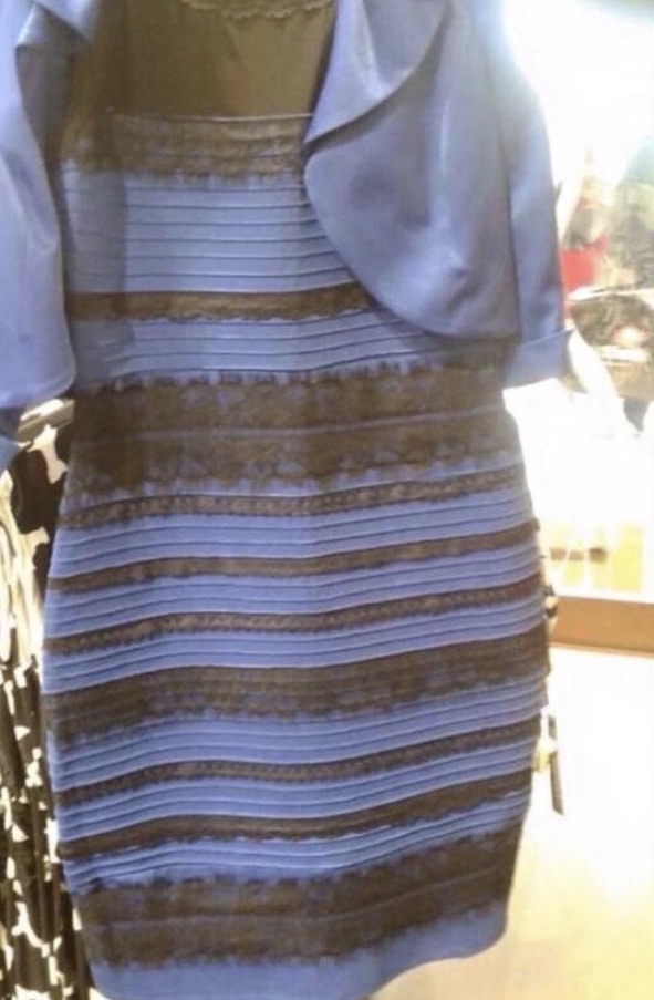
For those of you who have been living under a rock and have not yet seen it, debate arose over what colour this dress is, with viewers unable to agree on whether the dress was black and blue or white and gold. Very quickly the dress was shared all over the internet with more than 10 million tweets mentioning it and hashtags such as #thedress, #whiteandgold, and #blackandblue began trending across social media platforms.
Whilst this dress made a fun talking point, it also highlights some interesting points about the nature of human visual perception and interpretation. How is it that two people viewing exactly the same image can see two completely different things?
Well, that’s what I am going to try to explain in this article.
So the first thing to note is that when we as humans view something, we have two methods of identifying what it is we are looking at: ‘top-down’ and ‘bottom-up’. Generally, when we think of vision and visual perception, we think of a bottom-up processing method; we take in visual information, this is then processed by the visual cortex where we interpret this information to understand and recognise what we are looking at. Nice and simple, Bob’s your uncle.
Except no, it isn’t that simple, and Bob is not your uncle. We also have this second method of visual perception- top-down processing. Top-down processing is a method whereby we use contextual information, memory and schemas to recognise patterns and interpret visual data. For example, look at this image:
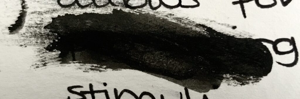
Looking at this image bottom-up, we can interpret that there is a white background and a black blob. Now consider this image:
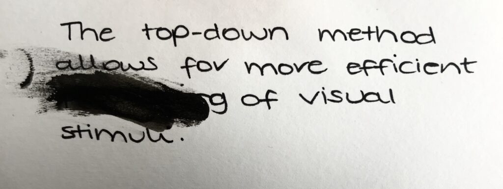
This image shows the same black blob, but in the wider context. Using top-down processing we are now able to extrapolate that the black blob in this context is likely to be an ink smudge over a word. Using the context of the topic we are talking about, our understanding of the English language, our memory of encounters with similar sentences and our expectation of what word should be there, we are able to work out that the word underneath the ink smudge is likely to say ‘processing’.
Pretty nifty right? I will do a more in-depth post about top-down and bottom up visual processing at a later date, but put simply, top-down processing allows for quicker, more efficient visual processing and more accurate interpretation of incomplete data.
So how does this all relate to the dress then?
Well when we look at the dress, we are using top-down visual processing to interpret the information. When we look at the image, we are extrapolating the data from the dress and the context of the photo, interpreting it and integrating it with our memory and expectations. In the case of the dress, the disparity in colour arises from our perception and interpretation of the light source illuminating the dress.
Let me explain…
Our eyes are constantly adapting to light. We are often aware of the simple adaptations such as pupils dilating and constricting in relation to the intensity of light, but our brain is also adapting to the colour of light as well. Have you ever taken a photo of something indoors and the image has come out looking very yellow? This is because our eyes have adjusted to compensate for the yellowy lighting so the scene doesn’t look yellow but the camera hasn’t. The image below shows the same room under different lighting. In the photo, the light is very different, but our top-down processing allows us to recognise that the wall is white and the chair is grey in all of these images despite the different lighting.
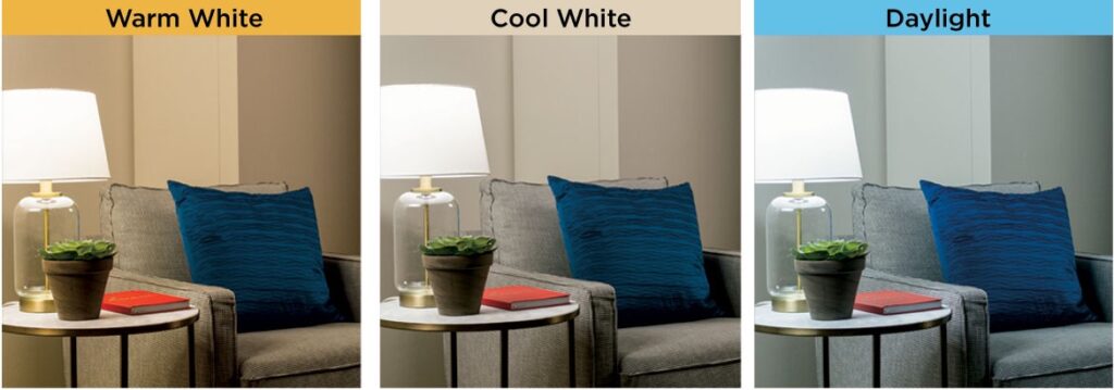
Looking at these images next to each other, you can tell that the lighting is different, and as such the wall looks slightly different colour tones in each image. But in each of these rooms, your brain would correct the effect of the lighting so you would always perceive the wall as being white.
Don’t believe me…? Look at this picture below. Which square, A or B, is darker?
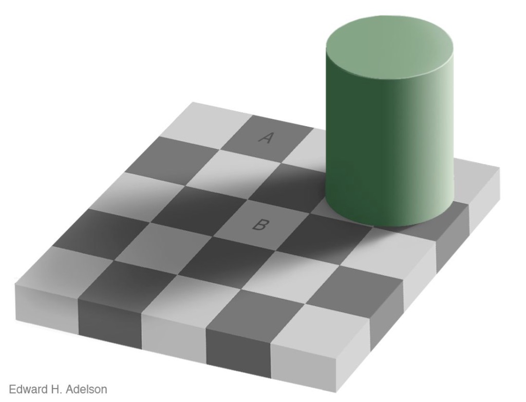
Well A is darker right…? Wrong! Both A and B are exactly the same colour.
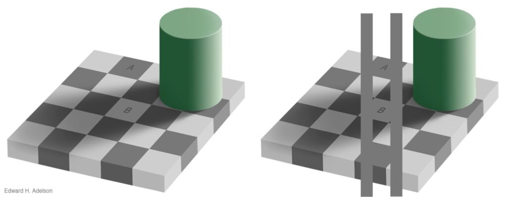
No, this is not some kind of witchcraft. A and B are exactly the same colour, and with the help of those bars we can see that. What is happening in the first image is our top-down processes are interpreting the light, the shadows and the context of the checkerboard which leads us to perceive that square A is darker than square B. If we remove the context by adding the bars in the second photo, our bottom-up processes can see that square A and B are actually the same colour.
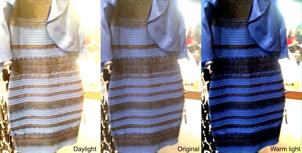
So let’s bring it back to the dress. As we saw from the three rooms above, daylight has a slightly blueish hue to it. In comparison, the warm lighting has a slightly yellowy hue. When viewing the image of the dress, if your brain interprets the light source to be daylight it will ‘filter out’ some of the blue tones from the image. By filtering out the blue tones, we can see that the dress looks much more white and golden.
However, if your brain interprets the light source as being warm fluorescent strip lighting, as commonly found in shops and supermarkets, it will ‘filter out’ some of the yellow tones. By removing some of the yellow hues, we can see in comparison that the dress looks much more blue and black.
Similarly, if your brain perceives the light source to be behind the dress and hence that the dress is in shadow, it will compensate for the shadow and interpret the dress as being white and gold. In contrast, if it perceives the light source as being infront of the dress and hence the dress is washed out by direct light, your brain compensates and perceives the dress as black and blue.
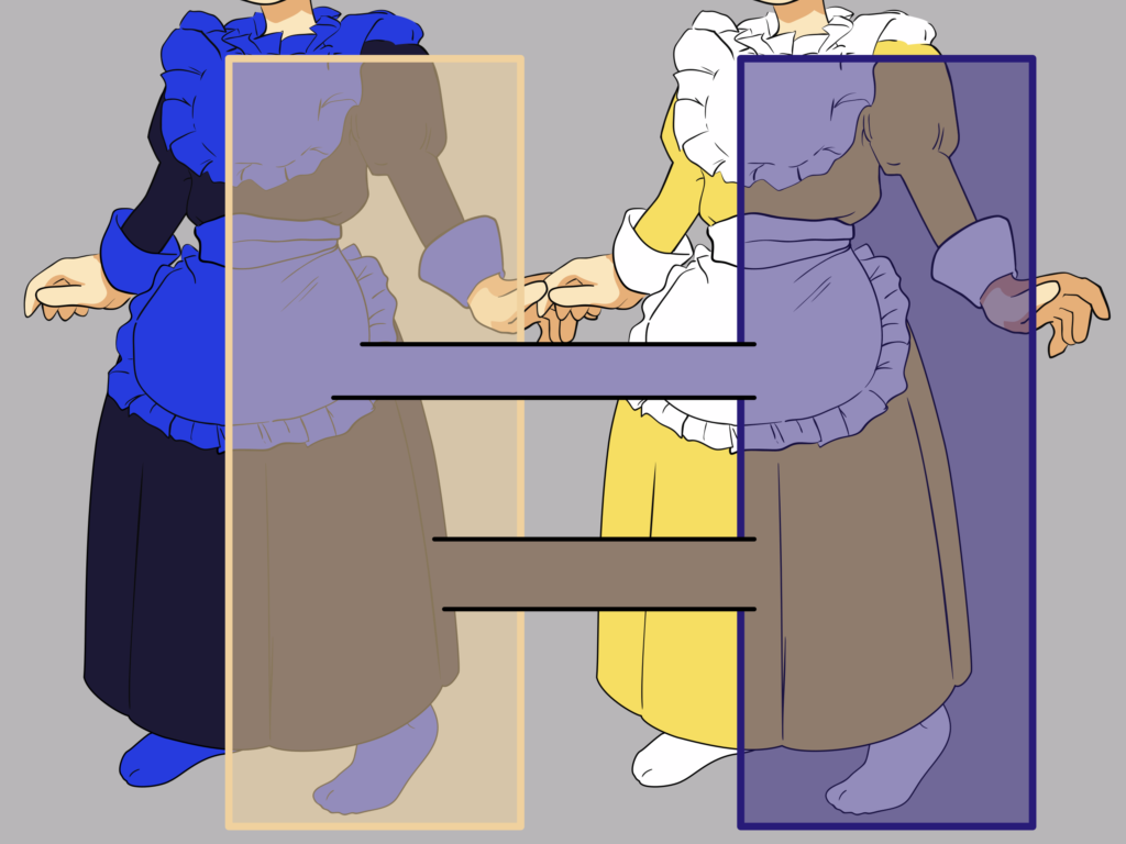
So, the brain sees what it ‘wants’ to see, depending on what and where it thinks thinks the light source is.
Phew, we can now relax. The brain perceives lighting differently. All is simple and Bob’s your uncle once again…
But wait… why do some people perceive the lighting differently to others?
Aaannnd once again, it isn’t simple. Bob is, once again, not your uncle and this article has more drama than a storyline from Coronation Street.
Now there are a few theories going around about this. There are some which seem a bit more airy-fairy such as the suggestion that Sagittarius sees white and gold because of their cosmic alignment (or however it works, I know very little about astrology…). But other theories seem a little more convincing.
The theory which makes the most sense to me, is that it depends on where and how you are viewing the image. Firstly, the image was almost always viewed on electronic displays. Different displays have different resolutions, colour profiles, brightness and contrast levels, etc. So a lot of the variations in how you perceive the lighting in the image and hence the colour of the dress can be attributable to the display you are using.
Secondly, I personally believe that the lighting you are in at the time of viewing will also impact upon how you perceive the dress. When you are in a daylight, your brain is more likely to interpret the lighting in the photo as daylight, ‘filter out’ the blues and perceive the dress as white and gold. In contrast, when viewing the dress in warm yellowy light, the brain is already primed to view the dress with the yellow hues filtered out and hence perceives the dress as black and blue. One study found that when the image was presented in artificial yellow-coloured lighting almost all participants saw it as black and blue (1). The same study hypothesised that people who are more prone to sleeping in late and staying up late are more likely to see the dress as blue and black. This is because their brains are ‘primed’ to view the world as though it is illuminated by yellowy light because that is what they are used to seeing.
So, the brain sees what it ‘wants’ to see, depending on what and where it thinks thinks the light source is, depending on what light you are used to.
Bob’s your uncle once again… probably.
References:
Lafer-Sousa, R., Hermann, K. and Conway, B., 2015. Striking individual differences in color perception uncovered by ‘the dress’ photograph. Current Biology, 25(13), pp.R545-R546.